WebKit and CSS3 rendering, still not quite there
Oct 1, 2009You may have noticed that I have been fiddling around with some more styling at GreyWyvern.com. I added a background to the sidebar and added some boxes with translucent backgrounds to highlight the text sections there. If you've read the About page, you also know that this site uses some CSS3 that isn't well supported yet, or at least not officially supported because the W3C takes so long to approve their recommendations!
Anyway, I wanted to give the sidebar boxes rounded corners using border-radius and replace the header shadow with CSS box-shadow. Both of these properties are supported in WebKit and Gecko using proprietary property names prefixed with -webkit- and -moz- respectively. Because the specification for border-radius and box-shadow might still change, using these unique property names ensures developers know not to depend on them always functioning the way they do now. Presto does not support any proprietary border-radius or box-shadow properties in a currently released build; although supposedly they are in store for version 2.3 of that rendering engine.
 In adding the new styles to the website, I first added them as both the
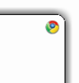
 -webkit- and -moz- proprietary properties so I could see how I wanted the finished product (once the Box and Borders module is complete) to look. However, I immediately noticed that Gecko's rendering was much nicer than Chrome. See the example animation for a comparison.
The obvious difference is that Gecko renders the curved corner with anti-aliasing. This alone makes the appearance ten times better than Chrome's pixelated version. Chrome's lines appear to disconnect at certain points, giving the border an interrupted look. Safari, which also uses WebKit, does some anti-aliasing, but compared to Firefox it's still a poor showing; it appears to leave the job only half-done. Pretty shameful if you ask me.
But the shame doesn't end there. In the example animation, both Chrome and Firefox have been given a box-shadow property of 0px 0px 15px 0px #000000. Which means (in order of appearance): 0px horizontal offset; 0px vertical offset; 15px of blur; 0px of spread; shadow should be black. You can see that Gecko's box-shadow is much smoother and expands further than Chrome's. Chrome's shadow seems to drop off exponentially, while Gecko's is a smooth Gaussian blur gradient. Safari's box-shadow property displays nothing at all unless you remove the "spread" element of the value. When you do, the shadow displayed is similar in extent to Firefox, but a bit washed out and lighter.
It seems such a simple thing, but you can see for yourself that it makes a huge difference. Chrome and Safari still need to work on things in this department, that's for sure. Bravo to the Gecko team for making sure things look right! Now it's up to the W3C to get off their butts and approve the darn recommendation, no? ") Enough discussion, guys; time to let it ride!
Enough discussion, guys; time to let it ride! 
Oh, and after I made sure the shadows and rounded corners looked right in Firefox, I removed all the proprietary -webkit- and -moz- properties and switched to plain border-radius and box-shadow. In other words, you'll have to wait until the browsers actually support the real thing before you'll catch a glimpse of these styles on GreyWyvern.com. 
| ⇐ Webcomics | Catching up with the Storm Hawks ⇒ |